About 512 minutes
George Edmund Street: Unpublished Notes and Reprinted Papers — A Reader’s Guide
Architecture
117,677 recorded words. 15 minutes difference from this book's estimate.
View Gutenberg source #58450
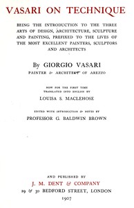
Before opening Vasari on technique — A Closer Reading, the edition data offers a quick orientation: 121,208 words, 8 hr 47 min estimated reading time, and 24 detected text sections.
The text analysis averages about 23.1 words per sentence, while the detected sections provide another way to judge how the source is divided.
Project Gutenberg metadata also associates the work with “Architecture -- Early works to 1800,” connecting these edition facts with the source record’s subject description.
Explore this collection
These alternatives are selected using recorded categories and estimated reading time.
About 512 minutes
Architecture
117,677 recorded words. 15 minutes difference from this book's estimate.
View Gutenberg source #58450About 546 minutes
Architecture
125,556 recorded words. 19 minutes difference from this book's estimate.
View Gutenberg source #71842About 484 minutes
Architecture
111,272 recorded words. 43 minutes difference from this book's estimate.
View Gutenberg source #38866Search stored excerpts and compare books → Choose by your preferences →
Choices use stored catalog measurements. Estimates vary with reading speed. A shared category is a catalog label, not a claim that two books have the same argument or literary quality.
Search reads excerpt text stored with this catalog and links to its associated Gutenberg record. The connection is stored in the site database; this tool does not recheck that every excerpt is word-for-word identical to that external record. Excerpt search does not cover every chapter and does not verify historical publication dates.
Catalog snapshot checked: 2026-09-25. Coverage: 95 public books, 95 available source excerpts.
Read the complete public-domain text at its original source.
Read on Project GutenbergVasari's introduction to the three arts of design, here translated by Louisa S. Maclehose and edited by G. Baldwin Brown, is not a collection of biographical anecdotes but a practical manual on materials and methods. The text opens with a detailed classification of stones—porphyry, serpentine, travertine, and others—each described with the eye of a craftsman who knows their working properties. This attention to the physical substance of art sets the tone for a work that treats painting, sculpture, and architecture as trades with specific techniques.
In the section on coloring, Vasari repeatedly compares pictorial harmony to music. He writes that colors should be blended so that 'a dark and a light are not left unpleasantly contrasted,' and that the eye is offended by 'colours that are overcharged or crude' just as the ear is offended by a 'noisy, jarring or hard' strain of music. The ideal, he states, is a 'concord that is established between the fiery and the flat tone' which 'delights the eye just as harmonious and subtle music delights the ear.' This analogy is not merely decorative; it underpins his entire approach to composition, where the painter must balance vividness with restraint.
Vasari warns against the practice of laying on colors 'flashing and vivid in a disagreeable discordance' so that they become 'like stains and loaded with body.' He criticizes painters who produce figures 'painted by the patches of colour rather than by the brush,' a method that destroys the illusion of relief. Instead, he advocates for a gradual recession of tone: figures in front should be kept light, while those behind become 'darker than the first,' losing color as they retire. This advice reflects a deep understanding of atmospheric perspective and the need for unity in a composition.
The treatise's opening chapters on architecture and sculpture reveal Vasari's practical knowledge of stone. He lists varieties such as 'Pietra Serena,' 'Travertine,' and 'Peperino,' noting their origins and uses. In painting, he extends this material awareness to the handling of shadows: 'projections'—shadows cast by one figure onto another—must be painted 'with sweetness and harmony,' lest the picture resemble 'a coloured carpet or a handful of playing cards.' The goal is always to make figures appear 'natural and in relief,' a principle that unites the three arts.
Readers approaching Vasari's text will find a methodical mind at work, one that values clarity, harmony, and the physical properties of materials. The translation by Maclehose preserves the directness of the original, while Brown's notes illuminate technical terms. This is a book to be consulted alongside the Lives, not as biography but as a key to the workshop practices that shaped Renaissance art.
Reading Vasari’s warnings about overcharged colors, I remembered my grandmother’s watercolor box—how she’d mix mud when she lost patience. His gentle insistence on restraint felt like her hand slowing mine. The mind of the artist — Context and Discussion once gave me that same quiet pause, reminding me that craft is mostly listening, not forcing. Both books feel like old friends who speak softly, then leave you alone with your own brushes. That stillness lingers.
Build a private reading journal entry for this title.