About 16 minutes
Oxford Water-Colours — A Closer Reading
Architecture
3,678 recorded words. 1 minutes difference from this book's estimate.
View Gutenberg source #55512
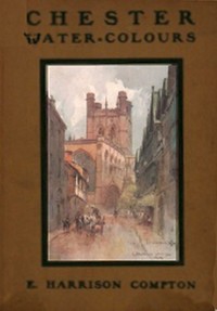
The catalog record for Chester Water-Colours — Reading Companion provides practical reading context through 3,368 words, 15 min estimated reading time, and 1 detected text section.
The text analysis averages about 20.4 words per sentence, while the detected sections provide another way to judge how the source is divided.
Project Gutenberg metadata also associates the work with “Chester (England) -- Pictorial works,” connecting these edition facts with the source record’s subject description.
Explore this collection
These alternatives are selected using recorded categories and estimated reading time.
About 16 minutes
Architecture
3,678 recorded words. 1 minutes difference from this book's estimate.
View Gutenberg source #55512About 18 minutes
Architecture
3,982 recorded words. 3 minutes difference from this book's estimate.
View Gutenberg source #66942About 33 minutes
Architecture
7,518 recorded words. 18 minutes difference from this book's estimate.
View Gutenberg source #61801Search stored excerpts and compare books → Choose by your preferences →
Choices use stored catalog measurements. Estimates vary with reading speed. A shared category is a catalog label, not a claim that two books have the same argument or literary quality.
Search reads excerpt text stored with this catalog and links to its associated Gutenberg record. The connection is stored in the site database; this tool does not recheck that every excerpt is word-for-word identical to that external record. Excerpt search does not cover every chapter and does not verify historical publication dates.
Catalog snapshot checked: 2026-09-25. Coverage: 95 public books, 95 available source excerpts.
Read the complete public-domain text at its original source.
Read on Project GutenbergE. Harrison Compton’s Chester Water-Colours presents twenty plates of the city’s architecture, each anchored by a caption that names a precise location—Watergate Street, the Abbey Gateway, the Pepper Gate. The list of illustrations reads like a walking tour: from the Cathedral’s north-east view to the Dee Mills, Bridge and Weir. Compton, a landscape and architectural painter active in the early twentieth century, worked in a series of county watercolour volumes for A. & C. Black. This 1916 edition belongs to that sequence, which also covered Essex, Hampshire, and other English counties.
The book’s structure is minimal: a title page, a list of twenty watercolours, and then the plates themselves. No descriptive text accompanies the images; the captions do all the work. They name buildings—Stanley House, Shrewsbury House (the “Bear and Billet”), the Falcon Inn—and sometimes note a viewpoint, as in “Chester Castle and Bridge, from South-West: Salmon-Fishers’ Boats in Foreground.” The list also includes interior subjects: the Lectern in the Refectory, the Cloister Garth, St. Werburgh’s Shrine. This range suggests Compton aimed to cover both civic and ecclesiastical landmarks, from the grand Cathedral to the half-timbered houses in Whitefriars.
Several plates foreground water: the Canal and Bridge of Sighs, Dee Mills, Bridge and Weir, and the Water Tower with Welsh Hills in the distance. The “Bridge of Sighs” is a local name for a footbridge over the canal, and its inclusion alongside working scenes like salmon-fishers’ boats points to Chester’s dual character as a historic walled city and a working port. Compton’s choice of the Pepper Gate—one of the city’s medieval gates—and the Phoenix Tower (also called King Charles’s Tower) shows an interest in defensive architecture. The half-timbered buildings on Watergate Row and in Whitefriars reflect Chester’s distinctive black-and-white vernacular, a recurring motif in the series.
Chester Water-Colours was published in May 1916, during the First World War, as part of a larger series of watercolour books on English counties and cities. The same publisher, A. & C. Black, issued volumes on Liverpool, London, Surrey, Sussex, and others. Each book followed a similar formula: a list of plates with brief captions, no explanatory text. This uniformity suggests the series was designed for tourists or armchair travellers who wanted a visual record of notable places. Compton’s illustrations for Chester stand out for their focus on medieval and Tudor architecture, with only a few modern elements—the canal, the bridge—intruding into the views.
Because the book consists solely of plates and captions, readers should approach it as a visual document rather than a guidebook. The captions provide enough information to identify each scene, but no historical or architectural commentary. To get the most from the watercolours, it helps to have a map of Chester at hand, or to compare Compton’s views with modern photographs. The series format means the book is best appreciated as part of a set, alongside the other county watercolour volumes.
I keep thinking about how that Chester book made me linger on old stone and timber, letting each place feel lived-in rather than merely seen. It reminded me of sitting with The French Impressionists (1860-1900) — Reading Companion, where light and shadow are handled with the same quiet tenderness, like someone softly telling you where to look, without ever hurrying you along.
Your answers remain private and are stored only in this browser.