About 186 minutes
Italian Villas and Their Gardens — Key Ideas to Explore
Architecture
42,609 recorded words. 0 minutes difference from this book's estimate.
View Gutenberg source #53495
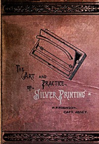
This digital edition of The Art and Practice of Silver Printing — Reading Notes is described by source-level measurements including 42,604 words, 3 hr 6 min estimated reading time, and 6 detected text sections.
The text analysis averages about 22.2 words per sentence, while the detected sections provide another way to judge how the source is divided.
Project Gutenberg metadata also associates the work with “Photography -- Printing processes -- Silver,” connecting these edition facts with the source record’s subject description.
Explore this collection
These alternatives are selected using recorded categories and estimated reading time.
About 186 minutes
Architecture
42,609 recorded words. 0 minutes difference from this book's estimate.
View Gutenberg source #53495About 184 minutes
Architecture
42,307 recorded words. 2 minutes difference from this book's estimate.
View Gutenberg source #53373About 182 minutes
Architecture
41,644 recorded words. 4 minutes difference from this book's estimate.
View Gutenberg source #32048Search stored excerpts and compare books → Choose by your preferences →
Choices use stored catalog measurements. Estimates vary with reading speed. A shared category is a catalog label, not a claim that two books have the same argument or literary quality.
Search reads excerpt text stored with this catalog and links to its associated Gutenberg record. The connection is stored in the site database; this tool does not recheck that every excerpt is word-for-word identical to that external record. Excerpt search does not cover every chapter and does not verify historical publication dates.
Catalog snapshot checked: 2026-09-25. Coverage: 95 public books, 95 available source excerpts.
Read the complete public-domain text at its original source.
Read on Project GutenbergThe authors open with a blunt defense: silver printing survives because it produces beautiful results, even if some prints fade. They argue that a charming but impermanent photograph is preferable to a permanent but ugly one, and they claim to possess twenty-year-old silver prints still in perfect condition. This preface sets the tone for a manual that is both practical and opinionated, blending chemical instruction with aesthetic advocacy.
The book moves from theory to workshop, covering albumenized paper, sensitizing baths, printing frames, and the handling of negatives. A notable feature is the detailed guidance on combination printing—assembling a figure from one negative into a landscape from another—complete with advice on masking, varnishing, and softening joins. The authors treat photography as a craft requiring both chemical precision and artistic judgment.
The preface establishes a central tension: silver printing is criticized for fading, but the authors counter that careful preparation and proper storage yield prints as permanent as any other. They write, “it is better to be beautiful, if fading, than permanent and ugly.” This stance informs the entire manual. The authors do not dismiss permanence; they aim to achieve both beauty and durability. Their evidence is personal: they have kept silver photographs from twenty to twenty-five years ago that remain “as perfect in tone and colour as when they were produced.” This claim anchors their credibility and frames the technical instructions that follow as methods to realize that ideal.
Chapters on the sensitizing bath and toning reveal a hands-on approach. The authors explain how to prepare and maintain the bath, warning that failure often stems from “a want of comprehension” of the whole process. They emphasize sequence: studying the subject in fragments leads to failure. Toning is treated as a critical step for both color and permanence. The instructions are precise, specifying concentrations and times, but the authors also acknowledge variability in materials and conditions. They do not promise foolproof recipes; instead, they teach the reader to observe and adjust. The tone is that of experienced practitioners sharing hard-won knowledge.
The section on combination printing is the most elaborate. The authors describe how to print a figure from one negative into a landscape from another, using a cut-out mask to block light. They advise printing the figure negative first, then aligning the print on the landscape negative. To soften joins, they recommend tearing the mask’s edge and applying black varnish on the back of the negative. For delicate areas like the face, varnish must go on the front. They also suggest using a white screen behind the figure to allow “an agreeable atmospheric tint” in the background, reserving stopping-out for dark or blemished areas. The goal is a seamless composite that looks natural.
For full-length figures, the authors insist the ground must be photographed with the figure to match shadows. They prefer studio work over outdoor because wind disrupts dresses and light is unmanageable. A simple foreground is best. When composing large groups, they advise capturing as many figures as possible in each negative and placing joins where they will be least noticed. They recommend making a pencil or charcoal sketch before photographing. These tips reveal a methodical, problem-solving mindset. The authors anticipate common difficulties—wind, mismatched shadows, visible seams—and offer concrete solutions. The advice is grounded in their own practice, not abstract theory.
This manual is best read as a companion to practice. The authors assume the reader has access to a darkroom and basic equipment. Their instructions are detailed but not exhaustive; they expect the photographer to experiment and learn by doing. The book’s value lies in its specific, experience-based advice on combination printing and toning, areas where many manuals of the era were vague. For modern readers interested in historical photographic processes, it offers a window into the craft’s technical and aesthetic priorities in the 1880s.
The rain blurred the windows while I read Robinson and Abney’s stubborn defense of silver printing—beauty over permanence, a fragile alchemy of baths and toning. Afterwards, leafing through their mentions of Victorian parlors, I found myself hunting for those rooms’ quieter bones. The English Home from Charles I. to George IV. Its Architecture, Decoration and Garden Design — Reading Companion smelled of old paper, and the afternoon softened into ceilings and cornices, unhurried as the fading light.
A brief reflection can help important ideas stay with you longer.